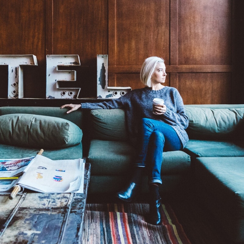
Color Trends in 2023
Color plays a critical role in your hotel’s overall design by evoking emotion and setting the tone for the guest experience. It should also reflect current trends based on client needs and desires. Otherwise, you risk your hotel looking outdated and out of touch.
In this post, you’ll learn the color trends we are seeing for next year based on the recent Sherwin-Williams Colormix Forecast 2023, so you can plan your next hotel project accordingly.
Hospitality Color Trends in 2023
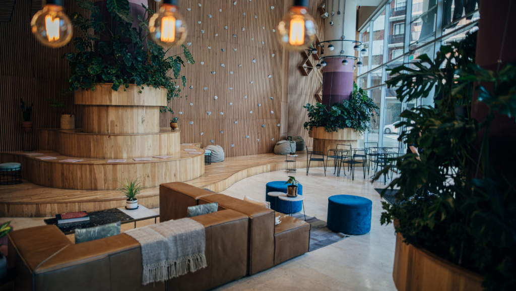
In a post-COVID world, the home has become a place of refuge for many as we navigate hybrid work environments and work-life balance. This new attitude, lifestyle, and hope for the future have shaped color trends. We find that guests want the same comfort when staying at a hotel.
2023 Color Trend: The “Terra” Color Scheme
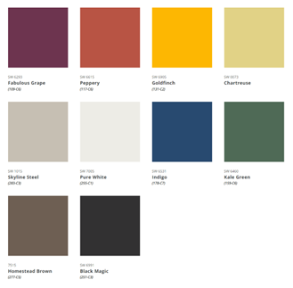
The name for Sherwin-Williams’ Colormix Forecast 2023 scheme is “Terra” and consists of four different palettes: Biome, Lore, Nexus, and Origin. Palettes are carefully selected to inspire creativity and establish a human connection to the planet. The key contributing undertone is that uncertainty will remain a dominant force in society.
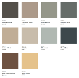
Palette #1: Biome
Biome is drawn from “planthropocene,” a vision for a new geological era driven by plants, nature, and humans’ love of nature. This palette exudes a “regenerative mindset” that gives back more than it takes and symbolizes a “circular system” that creates sustainable solutions for a new era of responsibility in managing the earth’s resources.
Inspiration for the Biome palette is found in marbled minerals, natural woodgrains, organic composites, and watery surfaces.
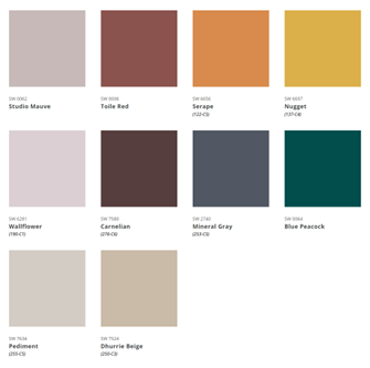
Palette #2: Lore
Lore is symbolic of the call to create and is about embracing the power of passionate creativity while merging cultures. This palette explores escapism at home and celebrates a hand-decorated look using folk inspiration, Bohemian influence, and a mindful approach.
The colors in the Lore palette express a hand-decorated look with regional woods and glowing metals that is indicative of the growing number of individuals participating in the crafts movement of DIY’ers, YouTubers, and TikTok’ers. This palette leaves us with the theory that while we do not wish to repeat the past, we will learn from it to create a better, more optimistic future.
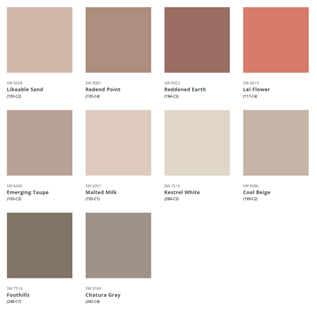
Palette #3: Nexus
Nexus envelopes warmth and a quiet place of feeling. It is mood-boosting and symbolic of humanity. The colors in this palette give us renewed energy and a sense of what it feels like to “come home.” Nexus allows us to connect to nature and celebrate unity in diversity. The inspiration for this palette is derived from warm patina, warm oxidization, calming geometrics, chalked textures, and ultra-matte sheens.
Palette #4: Origin
Origin symbolizes joy while looking back but forging ahead. This palette celebrates the then and the now with tried-and-true classics, free-spirited brights, and restful neutrals. The influences for Origin are the Hybrid Lifestyle, Tech Fatigue, Nostalgia Effect, and the “Let’s Go” mentality, which have all resulted from the recent pandemic. This palette represents healing, utilizing hues from the sunset and playful materials in a diffused direction, and reminds us that shared experiences connect us to our environment and each other.
At Innvision, we stay ahead of the game by tuning into Sherwin-Williams’ Colormix Forecast of 2023 to ensure we can apply the latest innovations to our clients’ projects. We also help determine the colors that speak to your brand, attract guests, and withstand the test of time. So if you’re ready to start your hotel project, contact us today!


